Module 5: Motion for Promotion
Reading & Writing
Technique is the word I’d use to describe this week’s reading from Animated Storytelling, Chapter 9. What I learned this week revolves solely the technical aspects of animation and using it to my advantage. (Click to read more)
One thing that really stuck with me after reading Chapters 9 of Animated Storytelling this week is how our technique supports storytelling. One of the main ideas is that strong animation is not just about drawing or movement, but about intention, and control. Knowing different techniques is what allows us to communicate emotions and personality effectively. A big part of these techniques includes knowing what effects or movements specifically align to your topic and how to properly time them. Without a solid technical understanding, even our best idea can feel flat or boring.
Another important takeaway is that our technique develops through practice and problem-solving. We have to continuously experiment, adjust, and sometimes fail before achieving smooth and believable motion. This indeed was my experience this week, where adjusting keyframes and refining motion in After Effects required my utmost patience and attention. Overall, Chapter Nine taught me that strong technique is what transforms simple movement into compelling visual storytelling.
Research to Inform
For this assignment, I found five examples of animation principles at work that enhance the way a story is told and kept my attention throughout viewing. (Click to read more)
Project #1: Tom & Jerry
I chose this project because of the way that staging is used to direct our attention from one place to the next as you watch the clip while not being overwhelming.
Project #2: Spider Man
I chose this project for it’s use of timing because the spidermanss leap is paced in a way that controls how fast we perceive the action, making the motion feel intentional and dramatic rather than rushed
Project #3: Pokemon
I chose this project because of the exaggeration principle where the character not only has heart eyes, but his movements are rushed and stretched showing a great deal of energy and emotion.
Project #4: Pink Panther
I chose this project because it uses anticipation as the pink panther is painting over his enemies wall and you see the buildup for his following actions.
Project #5: Shrek
I chose this project because it shows follow through as you can see shrek’s body still moving involuntarily but you know there is change occurring there, allowing the transformation to feel smooth.
Create
This week I created a Logo Stinger using Adobe Illustrator & After Effects. (Click to read more)
This week’s project was both challenging and rewarding. I decided to create an animated logo for my own photography brand, AR Visuals, which focuses on lifestyle photography. I wanted the animation to feel clean, minimal, and modern to match the aesthetic I’m trying to portray. The process required me to really think about timing, spacing, and how subtle movements can change the overall feeling of a design. That’s why I had had the ripple effect throughout the letters for visual as each one popped on screen. That felt like a subtle but polished effect. I also had a bit of a zoom in and out on the circle in the background to try and capture the lens of a camera in motion.
I did have prior experience with Adobe Illustrator, so I felt comfortable creating and outlining my logo as a vector file before bringing it into After Effects. However, animating it was a different experience and required more precision than I initially expected. Separating my layers correctly and adjusting keyframes for smooth timing took some trial and error. Overall, this project felt especially meaningful because I have been slowly curating content for my own photography Instagram page, and this logo animation is something I can genuinely look back at and potentially use.
Logo Stinger Final:
Module 4: Production & Post
Reading & Writing
Resonance is the word I’d use to describe this week’s reading from Animated Storytelling, Chapters 7 & 8. What I learned this week revolves around how sound and design choices can shape the mood and meaning of a story. (Click to read more)
One thing that really stuck with me after reading Chapters 7 & 8 of Animated Storytelling this week is that animation is not only about what happens in front of the screen, but it is also about what happens in front of our ears and how we are presented with all visuals. Even the smallest detail can chanrge the mood of the scene completely. It helped me realize that every little detail matters even the ones that go unnoticed like background music.
Chapter Eight focuses on design principles for animation, such as layout, visual flow, and text or graphics supporting your story. I liked how it demonstrated how small changes in design, such as text spacing, alignment, or the timing of text animation, can help make a scene look more refined and understandable. This reminds me of myself, when I’m trying to visually show my students why we need to use design principles. I am interested definitely interested in experimenting with adding some design flair to my project to help improve my storytelling.
Research to Inform
For this assignment, I found four stop motion animations that really caught my eye for their creative use of sound and design principles, and how they tell a story without words. (Click to read more)
Project #1: Audi Gingerbread Village
I chose this project because of Audi’s use of sound effects and background music to make this animation super lively and festive. The sounds of the wind when starting before the music cues is great along with the car revving as you see it drive brought this animation to life and kept my attention.
Project #2: Lego Disney
I chose this project for it’s use of sound and movement and showing how they can work together to create mood and timing. The music drives the energy of the scenes and helps the stop‑motion visuals feel engaging.
Project #3: Kinetic Typography Video
I chose this project because of the way the animated text moves in different ways, such as sliding, expanding, and bouncing, popping in, showing how motion can make words feel engaging and visually connected to the story being told.
Project #4: Rebrand Intro Burger King
I chose this project because it uses animated text and design elements to visually communicate a brand message without actual product images, showing how moving text can tell the story and overall visual experience in a video.
Create
This week I put together my linear story using Adobe Premiere and After Affects. (Click to read more)
This week I did my Plushie Makes a Bouquet linear stop motion story idea. Bottom line: It was really hard, for me. I did not have the things I used for my test animation. So I had to use what I had and make changes as I went along. I had some trouble getting the timing and frame rate right. Even with all these problems I made a 30-second animation of my Plushie making a Valentines bouquet. I was happy I could do it and I do think it turned out well given my difficulties.
The Plushie animation was fun to make. Why I chose to use my llama plush, I don’t know. It definitely made it harder but was worth the practice and still cute. I focused on telling a clear, simple story, adding background music, and including titles to make the animation feel complete. It wasn’t perfect, and the lighting and camera setup weren’t ideal, but I’m proud that I found ways to adapt and get it finished.
Stop Motion FINAL:
Module 3: Pre-Production in Action
Reading & Writing
Impact is the word I’d use to describe this week’s reading from Animated Storytelling, Chapters 5 & 6. What I learned this week revolves around how color and motion can create feeling in a story. (Click to read more)
After reading chapters 5 & 6 in Animated Storytelling, only one word comes to mind. Impact. These chapters reminded me that animation is not all about making things move or even looking fancy. Every decision from color and motion to timing can make a story feel different and the audience’s relationship with it even more so. Even small details can make big differences in how a moment lands.
Chapter Five is focuses on color in animation, which is one of my favorite topics. This topic alone made the chapter really enjoyable because it shows how you can use it to create mood, direct the viewer’s eye, and even character personality. I’m definitely excited to mess around with this in my own stop motion animation if possible.
Chapter Six explains the guidelines for movement, timing,, and exaggeration. These are small changes, like stretching or squishing, which can bring life to objects. The chapter made me ponder whether I could introduce these kinds of changes to my plush story.
Research to Inform
For this assignment, I found five stop motion animations that really caught my eye for their creativity, movement, and how they tell a story without words. (Click to read more)
Project #1: Chucky Story/ Toy Story Meets Chucky
I chose this project because of its relation to my stop motion ideas. It was cool to see the smooth flow of movement and the way that each frame was closely timed so that the motion felt very fluid.
Project #2: Snoopy and Friends Stop Motion Film
I chose this project for it’s use pacing and quick cuts to keep a playful vibe throughout the animation along with the background music that was upbeat and lively.
Project #3: Paper Drift Cars Racing Around Shop
I chose this project because of its appeal to viewers. This one felt very created as they used pieces of paper and cotton to act as smoke when the cars would drift and the sound effects definitely helped to capture the story they were telling.
Project #4: Audi Gingerbread Village
I chose this project because of its appeal to myself. I love Audi (I also have one.) This stop motion project felt very advanced and looked so smooth moving from frame to frame.
Project #5: Candy- Short Stop Motion Film
I chose this project because of I really liked how to motion created a sense of rhyhtm as each m&m appeared and moved around the table. They were very consistent in making sure each frame was spac
Create
This week I put together two stop motion story ideas with full storyboards and templates. Each one has its own style, and I added reflections on my process, challenges, and which story I’m leaning toward. (Click to read more)
I created two stop motion story ideas: one linear and one non-linear. The linear story follows a plush making a paper bouquet, and the non-linear story uses a countdown Valentine format. I hand-drew all the storyboards frame by frame, added arrows to show movement, and labeled each shot with the type of framing I plan on using.
Working on these templates really made me think about color, motion, and how small details can tell a story. I also had fun experimenting with different visual compositions and thinking about how color and movement could make the scenes feel more emotional. Overall, this process gave me a better sense of how to plan a stop motion animation from start to finish, and I’m leaning toward using the non-linear story for my full project because it feels simple but expressive.
Stop Motion Test:
For my stop motion test, I created a short animation using a handmade heart and my iPhone 16 Pro Max. I tried to capture the frames and focused on keeping the movement simple and intentional. Even though the animation is only a few seconds long, it helped me understand how much patience and precision goes into making objects feel alive.
This process was more challenging than I expected, especially making sure the motion stayed smooth and consistent while keeping my hand out of the frame. Overall, this test gave me a better sense of timing and movement, and it will definitely influence how I plan and execute my final stop motion project.
Module 2: Animating with AE
Reading & Writing
Intention. Intention is the singular word I’d use to describe this week’s reading from Animated Storytelling, chapters 2-4. What I learned this week revolves around storytelling and intention. (Click to read more)
After reading chapters 2-4 in Animated Storytelling, only one word comes to mind. Intention. These chapters i reminded me that Animated Storytelling is not about making things move or look cool. It’s about how we can use animation to enhance a story, tell a message, or even entice the viewer. Every single decision you make, like how fast or slow something moves or how you set up the scene should aid in telling your story.
Chapter Two is focuses on storytelling in animation, which is essentially the foundation. This is where you learn that good animation is really about being clear on what you want to say. You need to know what you are trying to do, who you are trying to reach, and what you want people to get out of it.
Chapter Three tells designers to use their life and things they see happening around them to come up with ideas. It reminds us that animation ideas do not have to be complicated to be good. Animation is really, about sharing ideas that mean something to you and to the people watching the animation.
Chapter Four was easily my favorite part of the book. The discussion around framing reeled me in right away, as it’s a topic I will be discussing with my students soon. Intentional framing is a big deal when it comes to visual communication. We have to be careful, about what we show and how we show it. Chapter Four reminded me that framing and planning are important because they help guide the viewers attention. They also make the story better overall. It was a good reminder that thoughtful structure and intention can elevate even the simplest animation.
Research to Inform
For this assignment, I found three motion graphics projects that stood out to me for their emotional effectiveness alongside their use of typography and imagery. (Click to read more)
Project #1: Google 2025 – Year in Search
I chose this project because of Google’s effective use of typography, timing, and imagery/videos. Each scene was thoughtfully planned with high quality clips alongside the perfect amount of words that was effective emotionally.
Project #2: Your Favourite Artists reveal Spotify 2025 Wrapped
I chose this Spotify Wrapped project for it’s use of typography and imagery but more so for the transitions it used to switch from frame to frame. Each frame flowed into the next smoothly whether it was audio or visual.
Project #3: RALPH LAUREN | The Polo Bear Chronicles: Operation Black Tie
I chose this Polo Bear project because of its appeal to viewers. Everyone loves the Polo Bear and while the bear doesn’t say a word, through his actions you are able to understand the story being told.
Create
This week, I created an animated personal introduction in Adobe After Effects, using a combination of typography, images (stock & my own), along with video and audio clips. (Click to read more)
For this project, I created a short animated intro to introduce who I am in a way that feels both personal and professional. I wanted it to feel relaxed and intentional, rather than overly polished or professional, so my focus stayed on clarity and storytelling.
I used a mix of text animation, images, video, and audio to reflect the different parts of my identity, including my role as a graphic design educator, designer, and photographer. I briefly explained how design has become part of my everyday life. I paid close attention to timing and framing, especially how text enters and exits the screen, since that was a bit more of a struggle in my last project.
Overall, this project pushed me to think more intentionally about motion and how small animation choices can shape meanings and stories being told.
Module 1: Basic Animation
Reading & Writing
Book is on Order. (Coming Soon)
Research to Inform
For this assignment, I collected GIFs that stood out to me because of their strong use of motion, smooth transitions, and/or clear storytelling in a short loop. (Click to read more)
GIF #1: Freezing Cold

I chose this GIF because It felt very accurate to the weather currently in NYC this weekend as we prepare for a big snowstorm.
GIF #2: STILL Freezing
This GIF also represents the weather outside and the way I bundled up for a short walk to the bodega up the block.
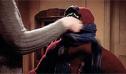
GIF #3: OUTSIDE
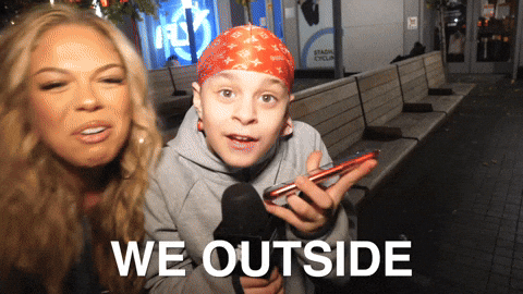
This GIF showcases my desire for it to be summer already, while I also enjoy that it is a bit longer compared to other gifs showcasing a full scene.
GIF #4: Elmo
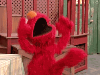
I admire the way, that no matter how long you stare at this GIF, it’s hard to tell when it loops back to the beginning. It looks very clean and simple.
GIF #5:

This GIF represents the idea I had with my own creation, however this one provides more 3D illusion than the one I created and it does flow better I feel.
Create
This week, I created three original GIFs using frame-by-frame animation to practice timing, layering, and making movement feel more natural. (Click to read more)
GIF #1: Cut Out

For this GIF, I chose to go with a Valentine’s Day theme. I used Adobe Photoshop to animate this GIF frame by frame so that they would have a playful pop effect. The simple motion of each icon (Freepik) allows for this animation to be engaging without completely overwhelming. Each frame was 0.2s long, however for next time I personally would extend the time of the last two frames so that It gives you a moment to process what you’re seeing.
GIF #2: Hand Drawn

For this GIF, I drew each heart by hand as you can tell. The goal of this GIF was to seem as though the heart was beating as the size of each heart either increased or decreased. Once again, I created this effect by drawing each heart on a separate layer and using frame by frame animation to replicate a beating heart.
GIF #3: My Choice.

For the last GIF I created, I went back to that pop in effect. As I kept going with a Valentine’s Day theme, I figured why not create one for my girlfriend for fun. This one I experimented with more icons (Freepik) and text. I enjoy creating the cut out GIFs as it came together nicely and next time, I would include more effects such as fading in and out between texts so it isn’t as choppy.
