Before working on Module 1, I tended to associate branding with specific visual elements like logos, color palettes, fonts, themes, and more. This is the way I broke it down for my students as well. After completing my brand strategy deck or some of it at least, my understanding has shifted. I read Graphic Design for Everyone and applied many of the concepts to my own design this week.
I now see branding as more than just aesthetics, I see it as communication. A first impression if you will. All elements like color, typography, and even layout are not just for aesthetic purposes but they shape the way your brand is interacted with. It determines the taste you leave in someone’s mouth and whether they’ll want to come back again. As designers, we are constantly communicating through visuals, and it’s important to be intentional with these choices as they are communicating your intended message. Another idea that resonated with me was designing with your target audience in mind. With my students, I have them practice target audience in the very beginning of the year. Its a concept that is basic foundation in any design so I always try to ensure that they think beyond their own likes and create designs that focus on the values of their audience, their preferences, culture just like I did when designing for South Queens Women’s March this week.
One moment that really made me reflect was reading about how a brand should be able to “stretch.” At first, I didn’t fully consider this when creating my initial slides. I think I assumed that because the organization I chose is community-based and already somewhat broad in its mission, the branding would be flexible. However, looking back, I realize that flexibility in branding is not just about being open, but it’s about being intentionally designed to grow.
A brand that can stretch is one that can expand into new platforms, reach new audiences, and adapt to different types of communication without losing its identity. For example, a community organization might grow from hosting local events to creating digital campaigns, partnerships, or even educational. If the brand identity is too narrow or visually inconsistent, it can limit that growth. This made me rethink some of my initial choices and consider how they might work long term.
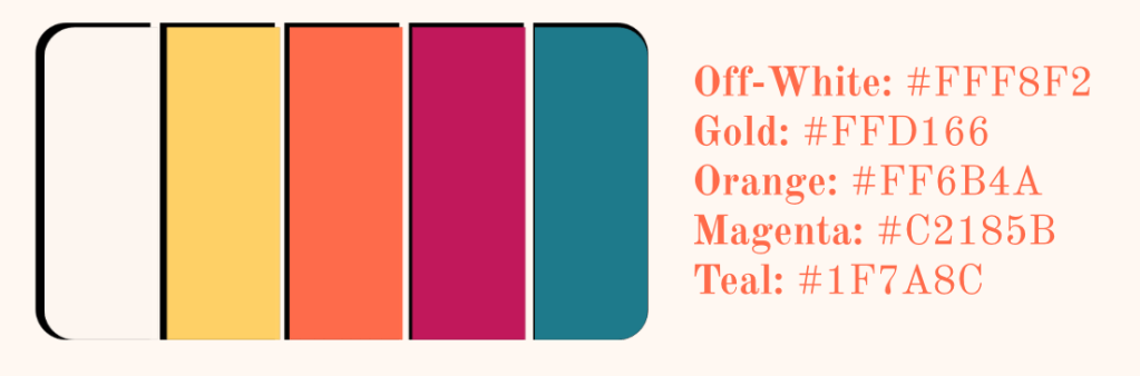
This idea connects back to the importance of consistency as well. A strong brand is not just one logo or one design, it’s a system that can be applied across multiple platforms while still feeling cohesive. The challenge is finding a balance between consistency and flexibility and did I realize that more than ever this week. I most definitely went through at least 8 different color palettes before settling on the ones I used but even that is still up for debate. Don’t even get me started on my font choices.
Overall, this module has changed how I approach design. Instead of starting with visuals, I now see the importance of starting with strategy and thinking about how a brand will function over time. The idea that a brand should be able to grow and adapt has made me more aware of the long term impact of my design decisions. Moving forward, I want to continue developing work that is not only visually aesthetic, but also thoughtful, adaptable, and rooted in a clear understanding of purpose and audience.

Leave a comment