This week, I worked on both wireframes and compositions for a newsletter and a website. This challenged me to think more deeply about how structure, layout, and user experience interact in a design.
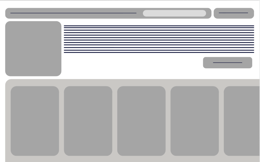
One of the key lessons I took away from this process is the importance of wireframing as a base for effective design. A wireframe isn’t about looks; it’s about structure. It allows designers to plan where content goes, set up a hierarchy, and figure out how a user will navigate information before adding any cool visuals. Working with gray boxes and basic layouts felt restricting becuase I couldn’t see the design if that makes sense , but I realized that this is where the real problem-solving occurs.
For the newsletter design, I considered how viewers interact with content when scrolling. Unlike a poster, newsletters need a flow that keeps readers engaged. I focused on making clear sections, using a grid layout, and organizing content in a way that feels easy to digest and engaging. The challenge was finding the right balance between visual interest and readability. Too much information in one area can bore you, while too little can also bore you. Wireframing allowed me to experiment with this balance before settling on a final design.
The website comp was a bit more of a challenge. Websites are interactive, you don’t just view information; you navigate it. This made me think about user pathways and how someone might move from one section to another. I had to ask questions like: What should a user see first? What actions do I want them to take? How do I guide them without overwhelming them, which led me to a scrolling pop up section on the bottom containing key information.
Creating the wireframe for the website helped me lay out a clear design, including navigation placement, and content areas. Once I moved into the design composition, I was able to use typography, color, and imagery in a way that built on the structure I had established. This made the final design feel put together instead of random.
Another important part of my work this week was understanding how consistency and flexibility relate. Both the newsletter and website needed to feel unified, especially since they belong to the same brand system. This involved using consistent typography, colors, and spacing. What stood out most to me is how much stronger my designs became when I trusted the process. In the past, I would often dive straight into design, focusing on the visuals first. This week reminded me of the importance of slowing down and building a strong foundation. Wireframing helped me think critically about layout and user experience before adding stylistic details.
As I continue to grow as a designer, I aim to carry this approach into future projects. Strong design isn’t just about looks; it’s about functionality. By prioritizing structure first and aesthetics second, I can create designs that are appealing and user friendly.

Leave a comment