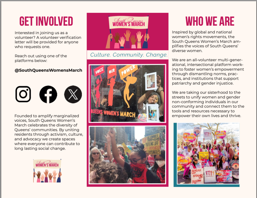
This week, I focused on hierarchy in layout while designing a brochure for South Queens Women’s March. It truly changed how I think about design. Before this project, I saw hierarchy as just making things bigger or smaller. Now, I understand it deeper. It’s about shaping how people experience information. Hierarchy guides a viewer’s eye. It decides what they see first, what they read next, and what they remember.
Without hierarchy, even strong visuals and meaningful content can feel confusing or overwhelming. With it a design becomes intentional, clear, and impactful. In my brochure design, I had to think carefully about organizing information across panels. Brochures need multiple sections like who we are, our mission, and how to get involved. I couldn’t just place text and images randomly. I needed to create a structure that made sense both visually and logically.
One key way I applied hierarchy was through scale. The most important information, like section titles, needed to stand out immediately, so I used larger, bold typography that is typically used by the brand as well. Supporting details were smaller and more subtle. This created a clear entry point for the viewer, making the design easier to navigate. I also focused on alignment and grid structure, which I initially struggled with. At first, my layout felt messy because elements weren’t lining up properly. Once I introduced a consistent grid system, everything felt more cohesive. The alignment helped reinforce hierarchy by creating order, making information easier to process.
Another important element was spacing. I learned that hierarchy isn’t just about what you include; it’s also about what you leave out. Giving elements enough space allowed each section to breathe and made the design feel less crowded. This separation guided the viewer more naturally through the layout. Color and typography played a role as well. By consistently using specific fonts like bold for headers and clean, readable text for body copy I created hierarchy throughout the brochure. This consistency made the design feel more professional and intentional.
What stood out to me most during this process is that hierarchy is not just a design principle, it’s a communication tool. For an organization like South Queens Women’s March, where the message revolves around activism, community, and empowerment, clarity is critical. If the design doesn’t guide the viewer clearly, the message can get lost. As a designer, this project pushed me to think beyond aesthetics. It’s not just about making something look good; it’s about ensuring it works. Hierarchy ensures that the audience understands the message quickly and effectively, which is the ultimate goal of any design. Moving forward, I will approach my work with more intention. Instead of asking, “Does this look good?” I’ll start asking, “Does this guide the viewer the way I want it to?” That shift in thinking separates basic design from strong, purposeful design.

Leave a comment